Designing Humanely’s Company OS
Overview
Company OS brings recruiting, HR, payroll, and compliance into a shared workspace. Company teams review records and take action there, while members use the portal for their own applications, pay, leave, and documents.
As founding designer, I worked across information architecture, interface design, and implementation. I designed how company teams find records, how members reach their own tasks, and how those flows share a design language.
- Company app examples
- 4
- Recruit, HR, Compliance, and Payroll in the captured October 2026 interface.
- Member role examples
- 3
- Candidate, employee, and alumni homes shown in this case study.
- Interface themes
- 2
- Lens is shown in light and dark in the October 2026 captures.
The design challenge
As the suite grew, its app boundaries were becoming the navigation. A hiring manager drafting an offer still needed the candidate’s details, and a compliance operator had to pick through multiple filing periods to find the underlying duty. The interface needed to make the next action clear while keeping the relevant record in view.
Planning the information architecture
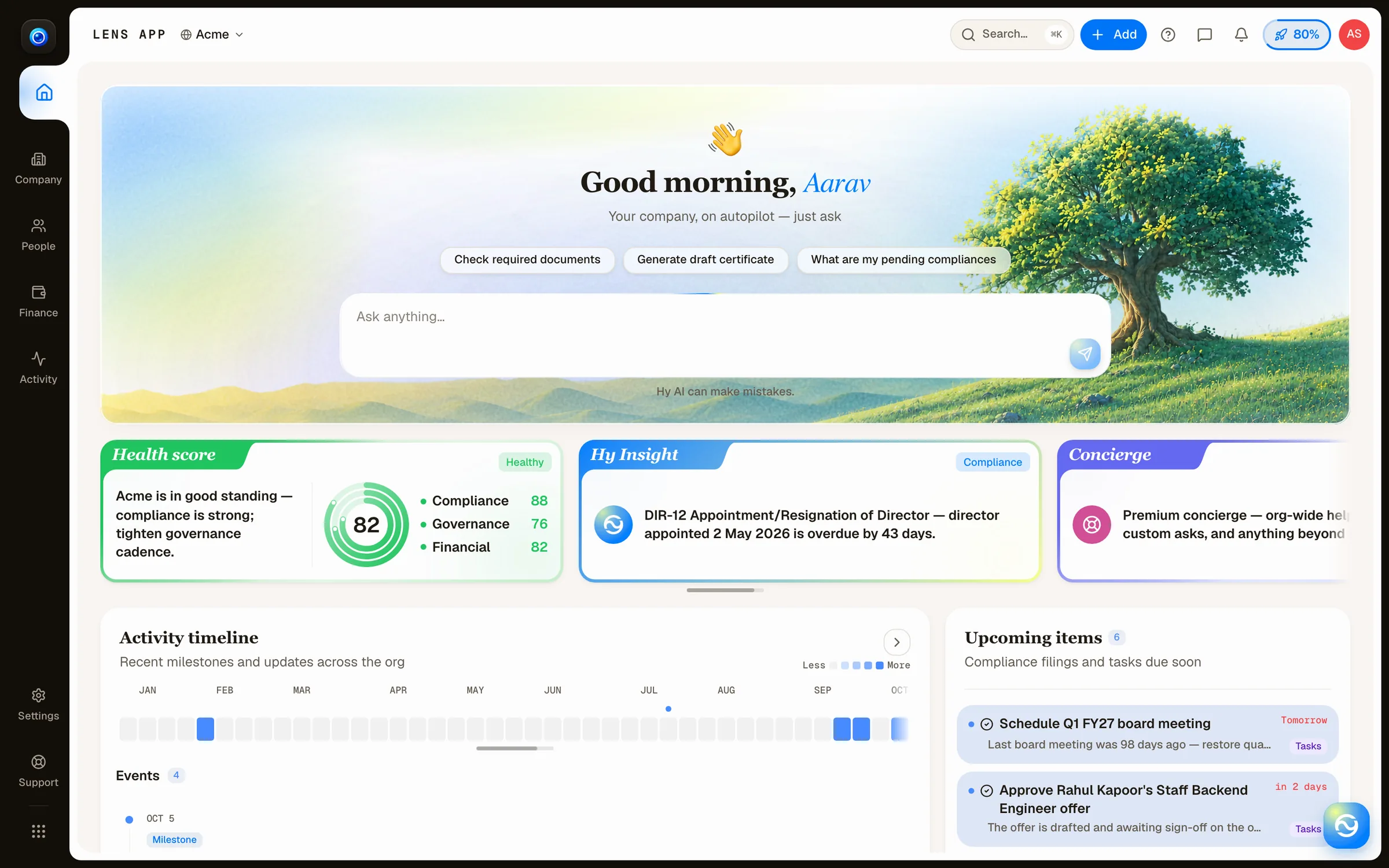
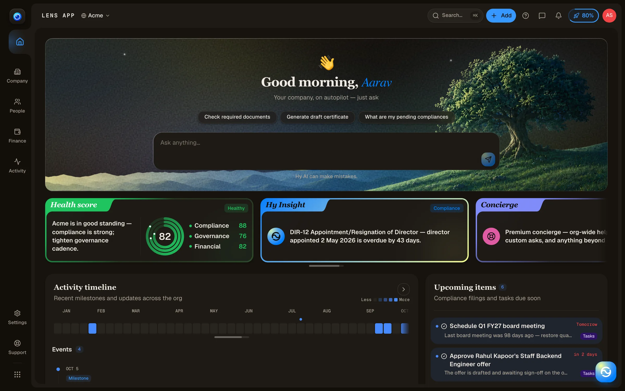
We organized the main rail around the work people recognize. Home brings together the overview and starting actions. Company, People, and Finance own their records, and Activity brings events into a single timeline.
- Company
- Legal entities, offices, assets, and business relationships such as vendors and customers.
- People
- Employee records, roles, and the org chart. Recruiting hands off to HR when a candidate is hired.
- Finance
- Money in, money out, and banking. Financial activity can reference a vendor whose record lives in Company.
- Activity
- A shared chronology for company events and changes across workspaces.
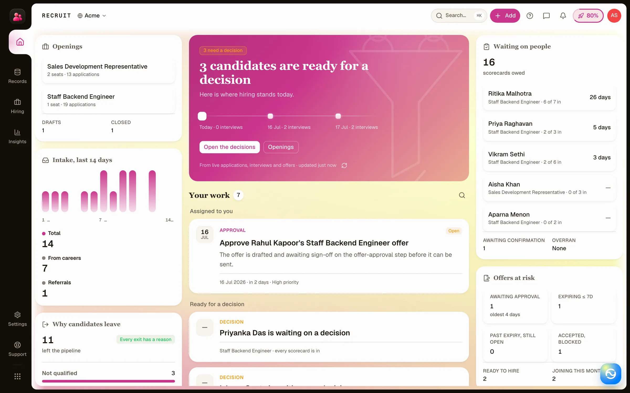
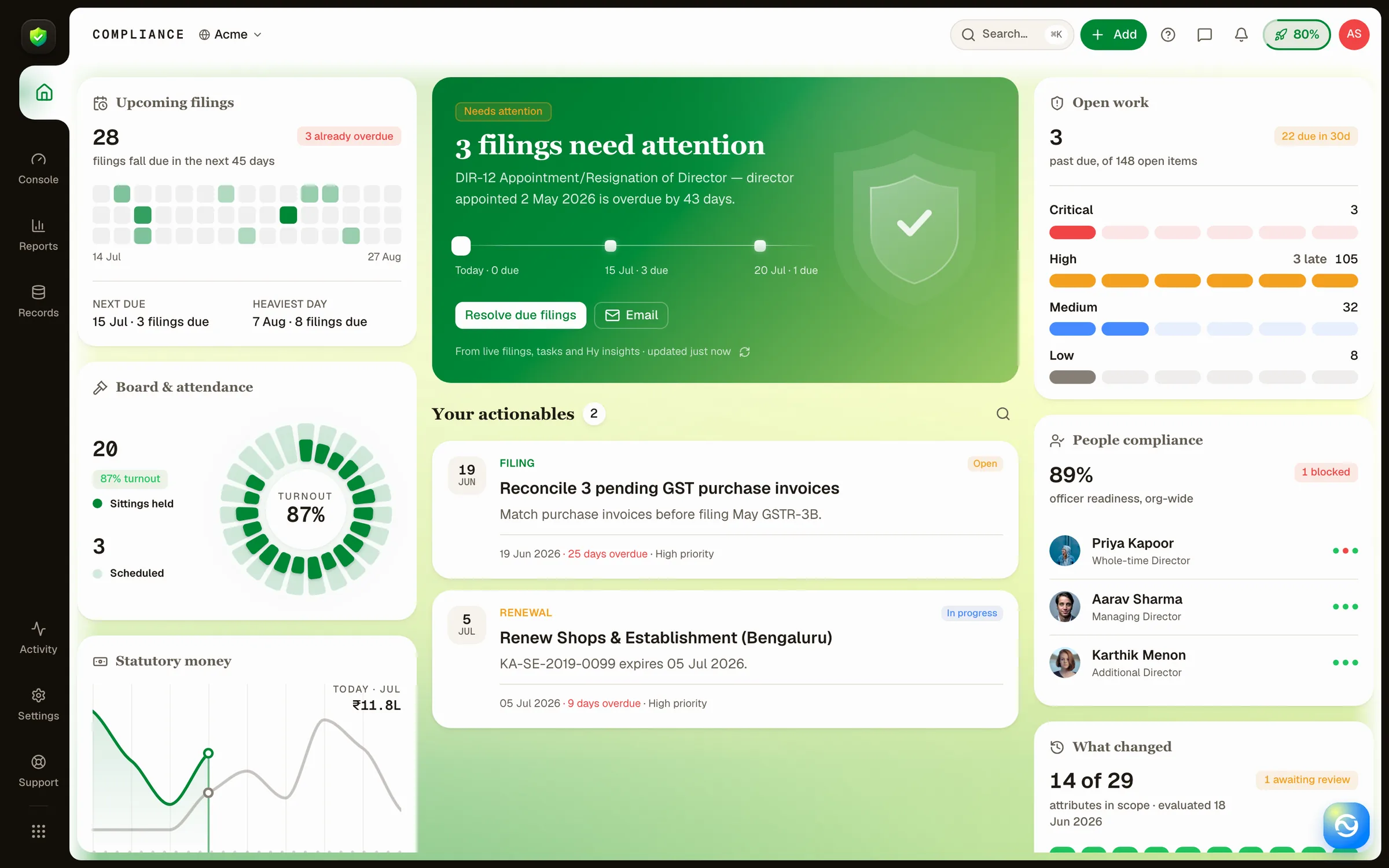
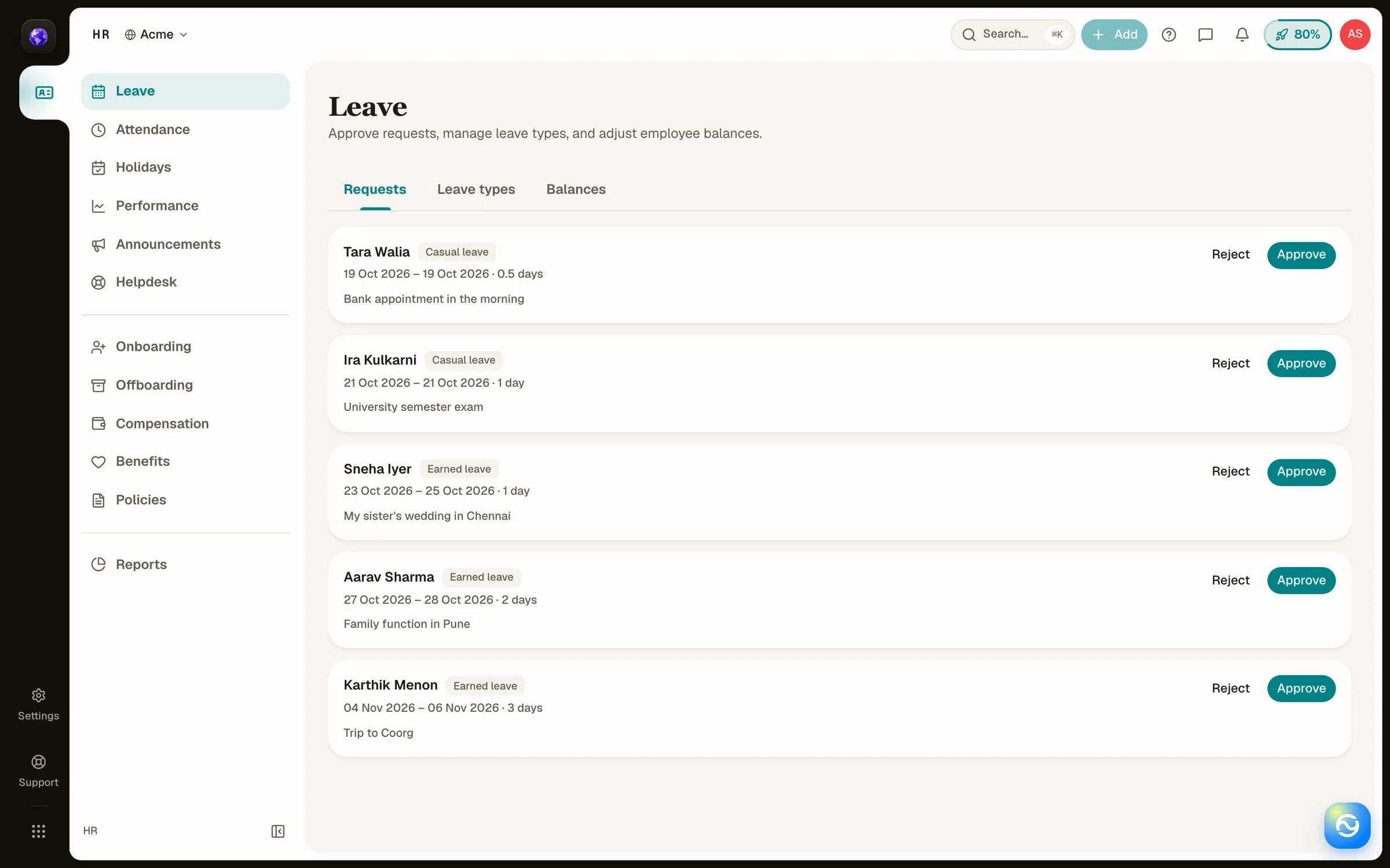
Recruit, HR, Compliance, and Payroll keep their own workflows inside the shared shell. The member portal gives individuals a separate home for their personal tasks and records.
UX decisions in practice
- Keep the record visible while someone acts
- When drafting an offer or scheduling an interview, a contextual panel keeps the candidate’s stage and key details in view. A full-page view gives the operator space for deeper review.
- Organize compliance around the duty
- A filing-first list repeated the same obligation across periods. We made the obligation the entry point and moved its filings into tabs so the operator can see the duty and its history together.
- Reuse collection behavior across views
- Tables, cards, and boards share filtering and sorting. An empty search offers Clear filters. A genuinely empty collection offers a way to create the first record.
- Protect edits and make status readable
- Shared forms keep validation and save actions predictable and warn before discarding edits. In recruiting, a pending action has its own label and color, with red reserved for a negative outcome.
A shared portal for three member roles
Member portal
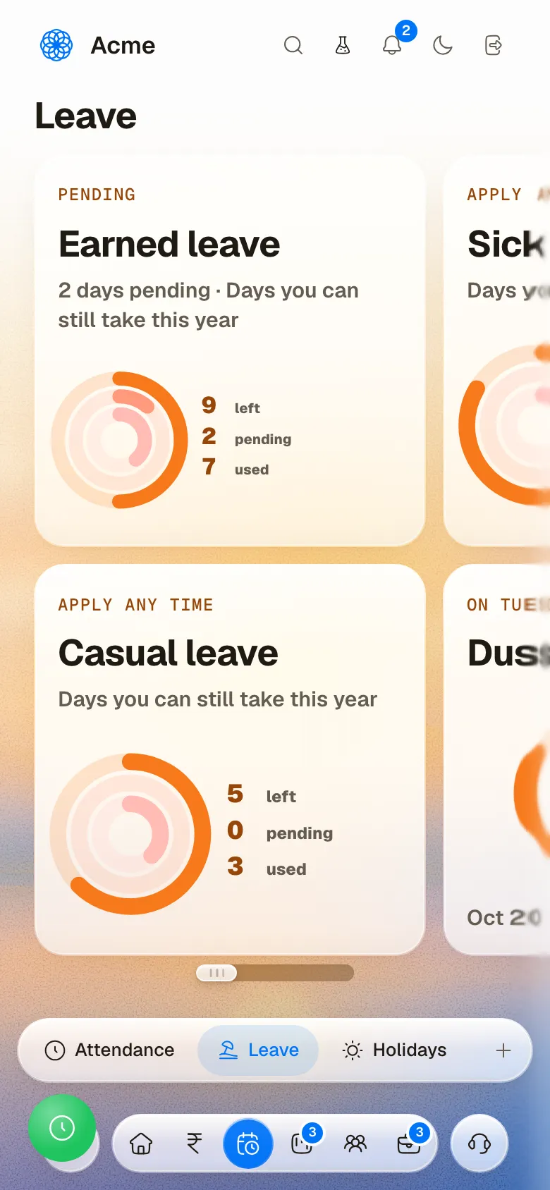
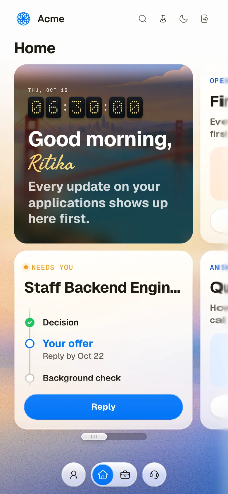
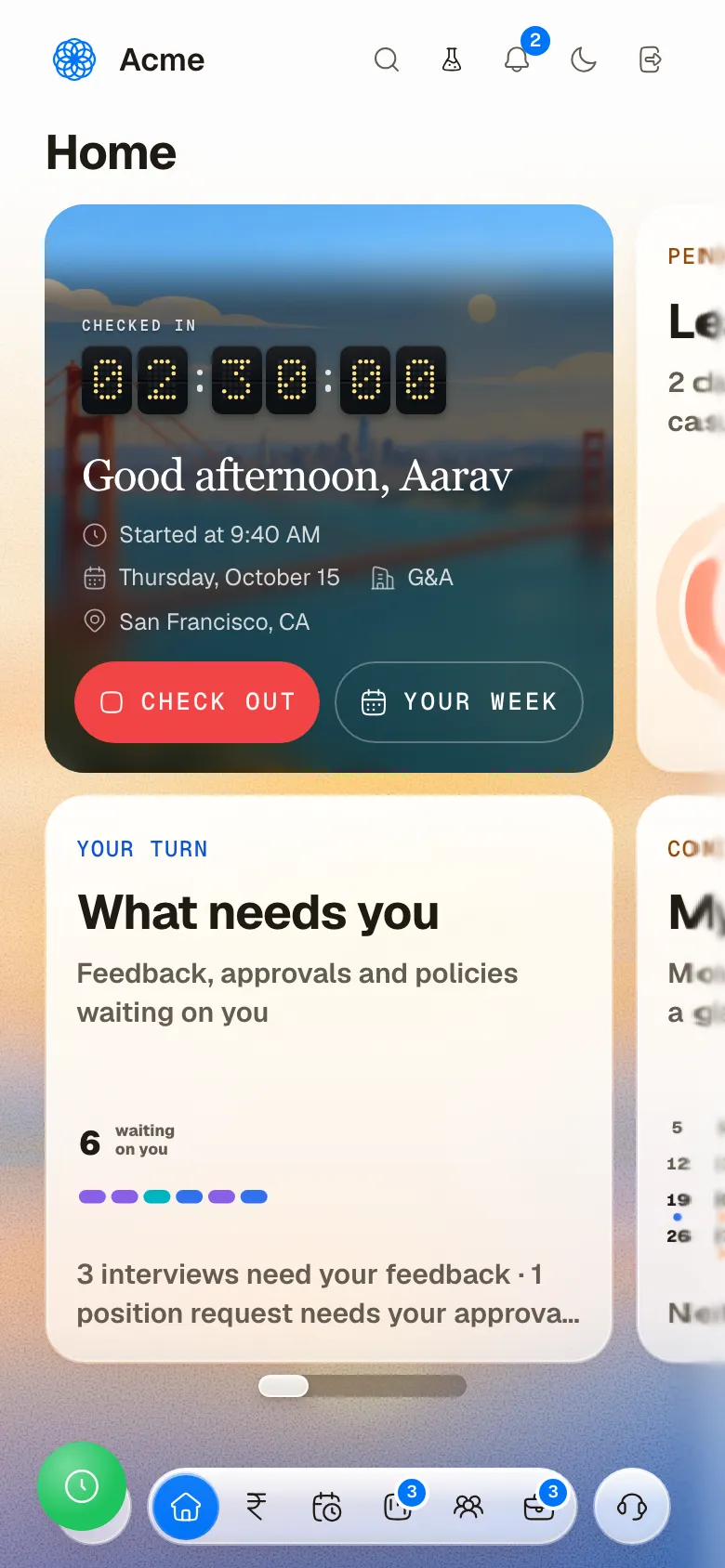
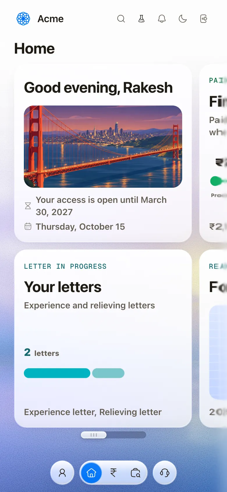
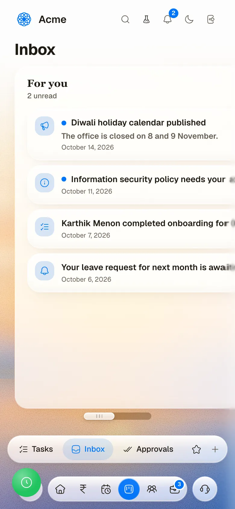
The member home changes with the person using it. Candidates can track an application and respond to offers. Employees can check in and review leave or pending actions. Alumni can find their letters. The same card structure gives each role a familiar home.


Humanely Design Language
Design system
HDL defines the type, color, spacing, and controls shared across Company OS. Neutral surfaces give dense records room to breathe, and app accents distinguish different workspaces. Status is communicated with labels and icons alongside color.
Color
Humanely blue
The Humanely brand accent in the captured interface.
- Tint#EDF4FF
- Info#478AFF
- Primary#0074F8
Sub-app accents
Each app carries one accent of its own on its buttons and focus rings.
- Recruit#CA358B
- HR#008186
- Compliance#008736
- Payroll#9C6A00
- Books#C64E00
Company
Module color for company records.
- Fill#EDE9FE
- Border#A78BFA
- Text#5B21B6
People
Module color for people records.
- Fill#FCE7F3
- Border#F9A8D4
- Text#9D174D
Compliance
Module color for compliance records.
- Fill#D1FAE5
- Border#6EE7B7
- Text#065F46
Finance
Module color for finance records.
- Fill#FEF3C7
- Border#FCD34D
- Text#92400E
Vendors
Module color for vendor records.
- Fill#E0F2FE
- Border#7DD3FC
- Text#075985
Customers
Module color for customer records.
- Fill#FEF9C3
- Border#FDE047
- Text#854D0E
Warm neutrals
Surfaces, boundaries, and text in the captured interface.
- Page#F9F7F4
- Card#FBFAF9
- Muted#F1EDE5
- Border#EAE5DC
- Divider#E8E3DA
- Placeholder#9E9082
- Quiet text#5A4A31
- Body#3C3121
- Heading#0F0C08
Success
Done and healthy.
- Tint#E7F6EF
- Color#22C55E
- Text#15803D
Warning
Needs a look soon.
- Tint#FFF4ED
- Color#F59E0B
Error
Blocked or overdue.
- Tint#FEF2F2
- Color#EF4444
- Text#DC2626
Chart colors
The categorical palette for charts and tags.
- Blue#3B82F6
- Emerald#10B981
- Pink#EC4899
- Violet#8B5CF6
- Teal#14B8A6
- Orange#F97316
- Highlight#FEF08A
AI and focus
Colors for the assistant, its gradient and the focus ring.
- AI#F7FE87
- AI cyan#7DBFC3
- AI blue#007FFF
- AI orange#FF6B35
- Accent#7367EE
- Indigo#6366F1
- Focus#0AA45E
Type
Geist
400 · 600
3 candidates are ready for a decision
Portal titles and interface text
Geist Mono
500
OCT 31 87% 16 owed
Numbers
- Hero72px / 72px
- Display30px / 33px
- Page title28px / 32px
- Stat22px / 25px
- Card title17px / 22px
- Body14px / 22px
- Label13px / 18px
- Meta12px / 17px
- Footnote11px / 15px
- Chart axis10px / 12px
From components to complete pages
Design implementation
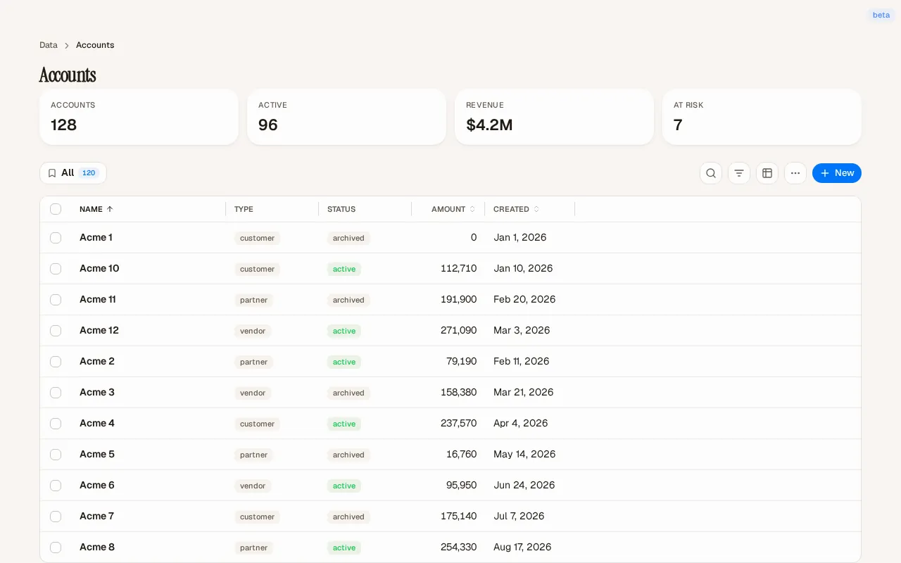
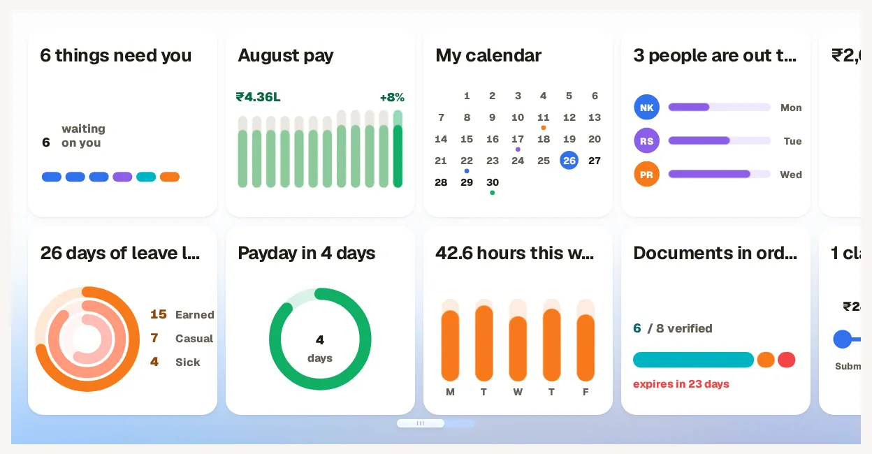
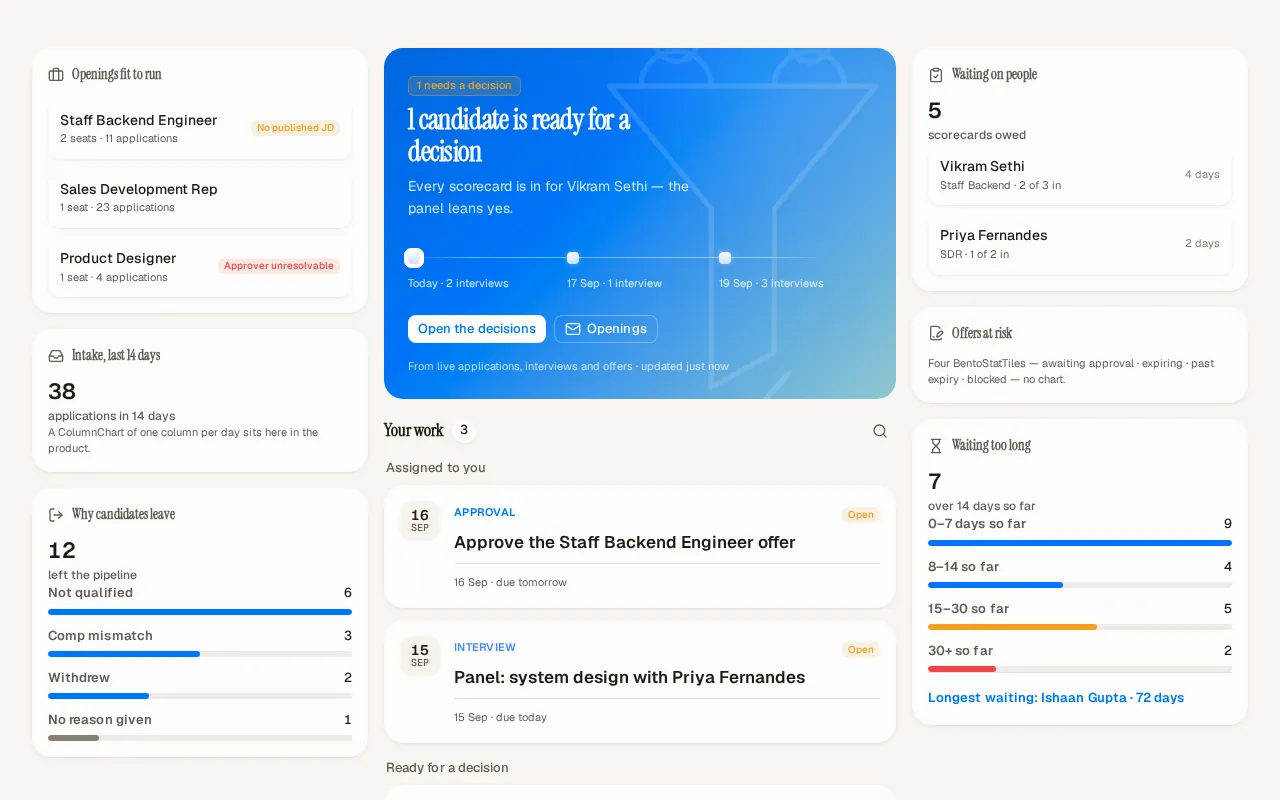
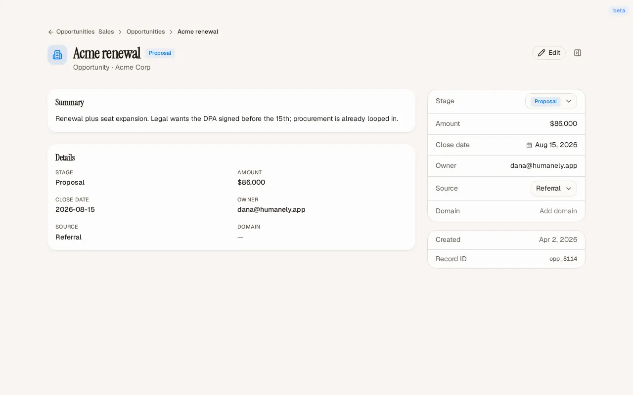
The library shows how shared controls work together on real pages. Collection views bring summaries, filters, and records into one place. Detail pages give record content and properties their own space, while portal widgets surface the next action for each member.
What the team built
The company and member portals use the same foundations for different jobs. HDL lives alongside the apps that use it, so updates to a shared control can ship with the screens that depend on it. The case study shows implemented patterns using sample company data.
Credits
Team
- reDesign Product interface design and HDL design system
- reLabs Engineering