Humanely
Explain the software and the people behind it
Problem
Humanely combines software, AI agents and a named human concierge. Founders, enterprise operations teams and GCC leaders each needed to recognize their situation without the website privileging one audience.
Approach
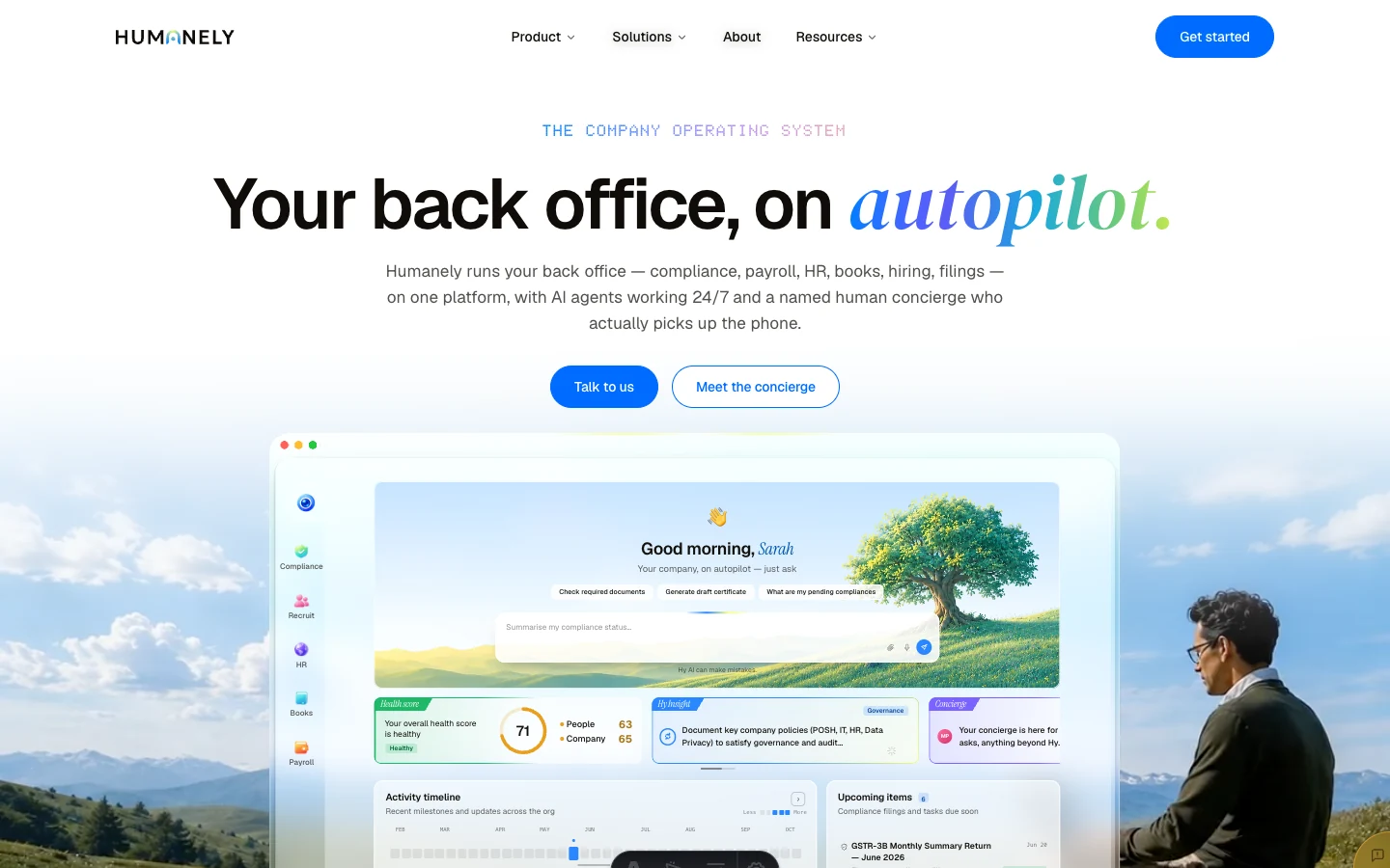
The site introduces equal-weight audience routes, then connects the platform, agents and concierge into one story. Product views and a named person appear together, making the operating model visible rather than leaving the human role to a footnote.
Visual identity
Light surfaces make the content and product views the focus. Warm near-black passages give denser scenes contrast. Blue identifies primary actions; lime and multicolor accents emphasize selected moments rather than competing with every paragraph.
#007FFF#F7FE87#FFFFFF#0F0C08- Display
- Your back office, on autopilot.Geist with DM Serif Display emphasis · one contrasting phrase establishes the headline hierarchy.
- Body
- One place for your people and operations.Geist · shared with the Company OS, connecting website and product.
- Labels
- THE COMPANY OPERATING SYSTEMDoto · a distinct technical register for short labels, kept separate from reading text.
Reusable elements
Neutral, raised cards and translucent panels form a shared scene language. App glyphs distinguish the tools; blue emphasizes the next action, while lime selects key elements. The assistant example keeps the request, proposed action and confirmation together. It is an explanatory brand scene rather than a working product screen.

Explanatory brand-scene details, not working product screens. Visual-language reference ↗
Explain the handoff between people and software
The page gives the dashboard and concierge distinct roles. The product view shows where work happens and the concierge imagery makes the human support visible. The Talk to us action gives founders, enterprise operators, and GCC leaders a shared next step.
Show the operating model
A product screenshot can show where work happens, but the page also needs to explain who helps when the work gets complicated. Pairing a dashboard with a named concierge turns that relationship into something a visitor can see.
Outcome
The implemented website gives each audience a route into the same offer, with recognizable page patterns and the concierge visible alongside the software.