Keep
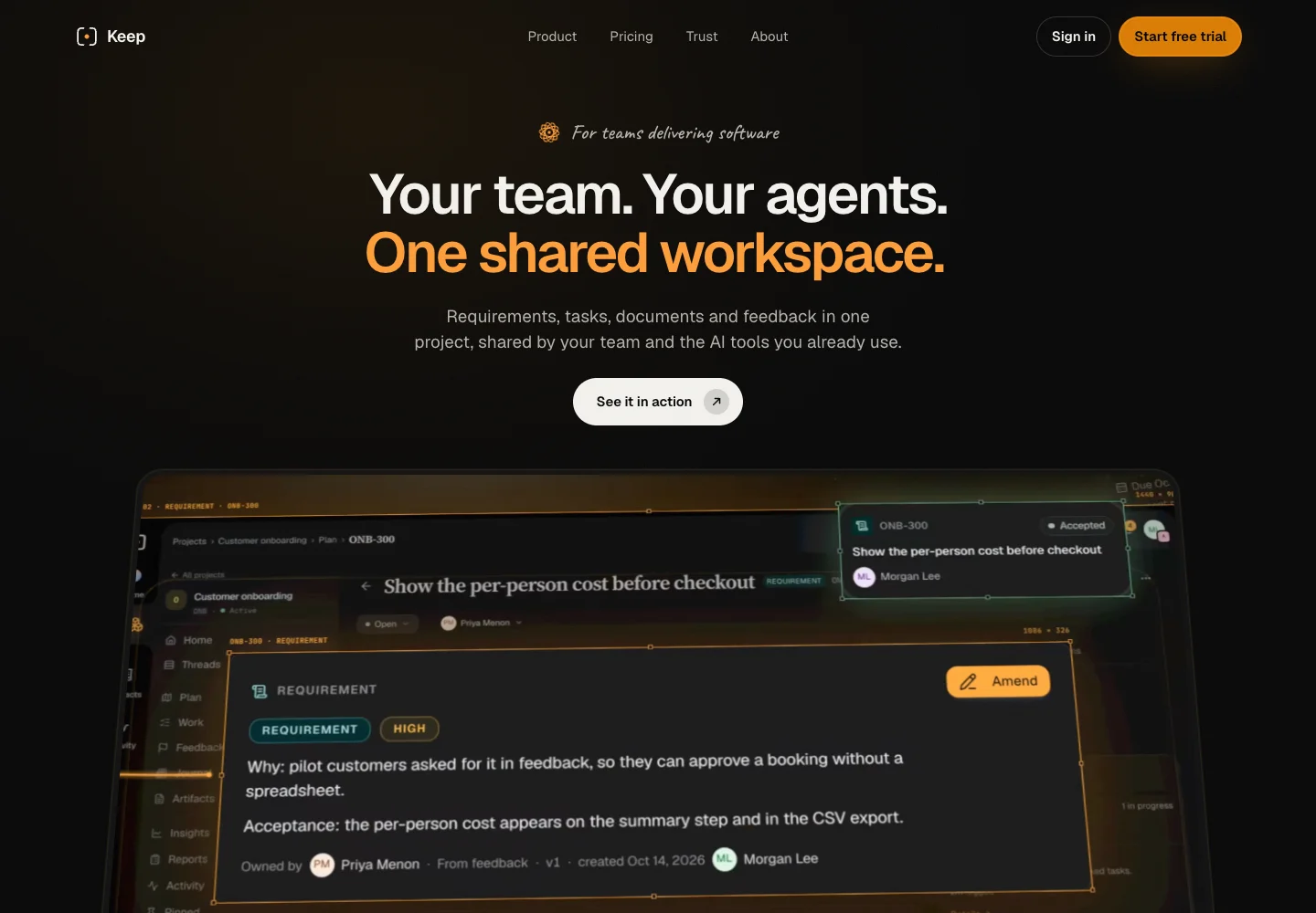
Show how the work connects before listing features
Problem
Planning, delivery, decisions and artifacts can become an overwhelming feature list. Visitors needed to see how those pieces connect before deciding to try Keep.
Approach
I designed and developed the website as one piece of work. Recorded product views follow a requirement through delivery, then show the team and its AI tools contributing to the same project record. Large headlines introduce each idea; product films supply the detail. Pricing and trust answer separate questions before the free-trial step.
Visual identity
A dark cinematic base puts the product screens forward. Paper and sand sections break the reading rhythm for facts and collections. Amber highlights selected words and actions on dark surfaces; light surfaces use dark text so the accent does not weaken readability.
#070707#FAFAF7#F3EAD9#DA7E07- Display
- Your team. Your agents. One shared workspace.Geist · tight, large headlines introduce one idea at a time.
- Body and controls
- Plan the work. Track it to delivery.Geist · shared weight and scale rules keep film captions, cards and navigation related.
- Eyebrows
- Built for the way teams workCaveat · a handwritten counterpoint reserved for short kickers, not long reading.
Reusable elements
Pill actions separate primary and secondary choices. A consistent line-icon family carries small functional cues, while record cards repeat the same kind, title, status and context anatomy. The dark surface and amber emphasis connect these elements to the product-film setting. The specimen uses actual current shared components with illustrative content.



Rendered from current shared components with illustrative content. Visual-language reference ↗
Put the product claim on screen
The site uses a shared headline hierarchy to establish what Keep is, then uses a product film to show the connected workflow in action. The published film runs 57 seconds. Poster frames and static fallbacks preserve a way to understand the page when motion is unavailable.
From the headline to proof
A visitor first needs a reason to care about connected work. The next section shows a requirement in context, then follows it through delivery and the record it leaves behind. That sequence gives the product film a job and gives the trial action a reason to exist.
Outcome
Visitors can inspect a concrete product tour before starting a free trial. The film uses illustrative sample records rather than customer project data.