Reveriext
Give a broad offer a clear place to start
Problem
A partner spanning strategy, design, development and operations can sound broad without helping a buyer find a starting point. The earlier three-practice story no longer represented the business.
Approach
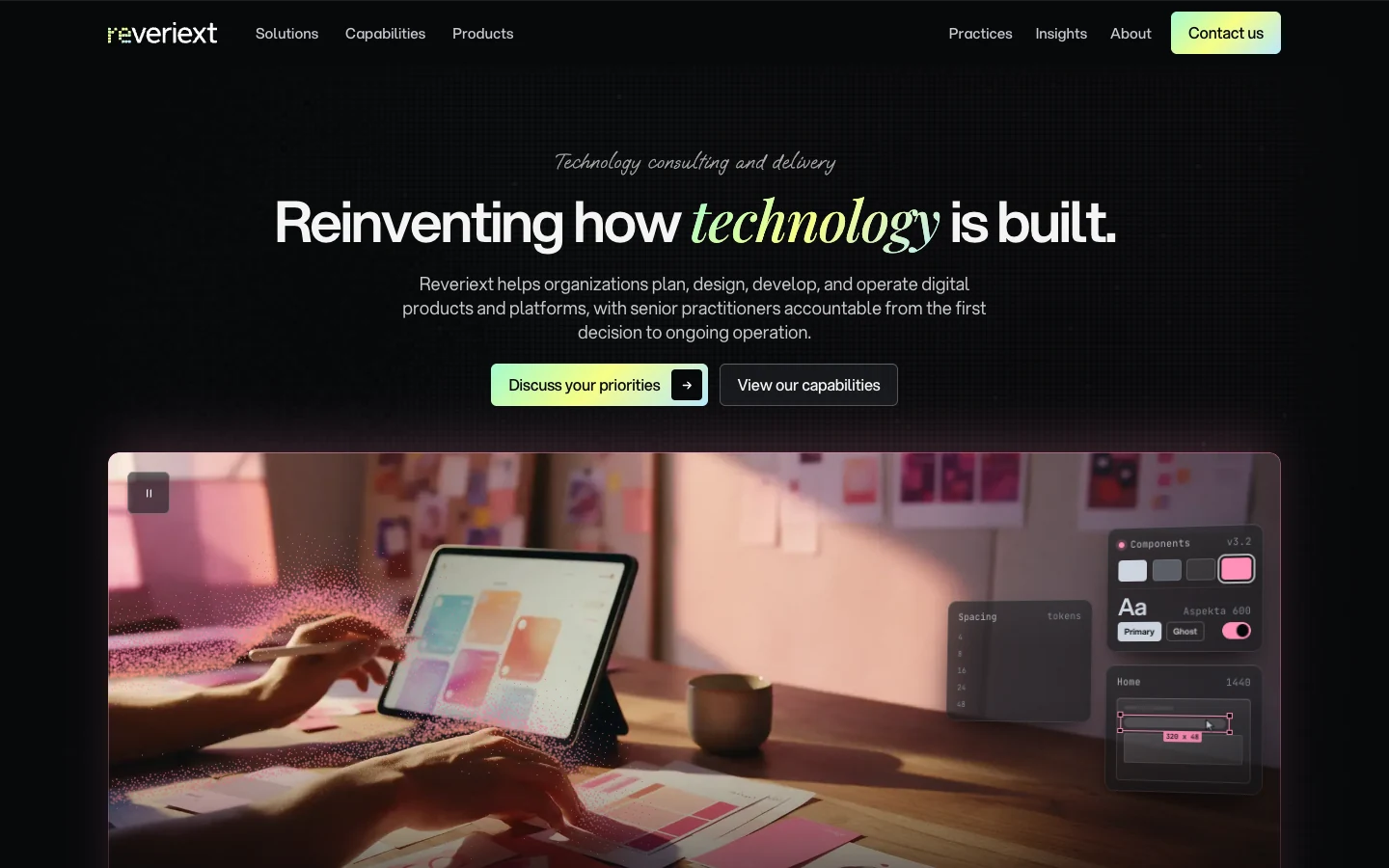
I designed and developed the website. The current structure gives reStrategy, reDesign, reLabs and reOps equal standing. Journeys such as launching a product or taking over an application connect those practices to the buyer’s situation.
Visual identity
Mint, lime and sky form the shared brand gradient against a dark opening. Blue, rose/coral, orange and mint distinguish the practices. The result is one recognizable identity with enough color differentiation to help visitors follow the service they need.
#A4FBD0#F7FE86#B7EAFF#07080A- Display
- Reinventing how technology is built.Aspekta with Playfair Display italic · one emphasized phrase guides the reading order.
- Body and controls
- Strategy, design, development and operations.Aspekta · the same clear voice carries long explanations and short actions.
- Handwritten accents
- Technology consulting and deliveryOooh Baby · brief editorial asides contrast with the structured service information.
Reusable elements
The shared button keeps its label and directional glyph together in one compact control. Outlined and brand-filled variants establish action priority. Fields repeat one anatomy: visible label, input, hint or error. A single glyph registry keeps arrows and control symbols consistent across pages. The specimen below renders those current components directly.



Rendered from current shared components with illustrative content. Visual-language reference ↗
Give buyers a path into the work
The page separates four practices and gives readers entry points based on their situation. A shared section and card hierarchy makes the routes comparable while each practice retains its own visual emphasis.
Make the services comparable
A buyer who knows their problem may still be unsure which practice to contact. The shared page rhythm lets them compare practices, while routes based on their situation provide another way into the work.
Outcome
The implemented site connects a visitor’s situation to a specific practice and next conversation, with a coherent visual identity across the four services.